VaughnT
Members
-
Joined
-
Last visited
Everything posted by VaughnT
-
The anvil's in great shape, but the price is a bit steep for a sub-hundred anvil. Of course, on the other hand, the anvil is sized such that it will be incredibly easy to move as you move, and you would certainly be able to recoup 50% of the cost if you should decide to sell it in a few years. Looking at it that way, and realizing that there isn't anything to break on the thing, well.... maybe $450 isn't so bad. Just make sure to fasten it solidly to as heavy a base as you can. It might be a lightweight anvil, but it will do for 99% of the jobs you'll ever come across if you have it fastened to the earth so it can't jump and wiggle with every hammer blow.
-
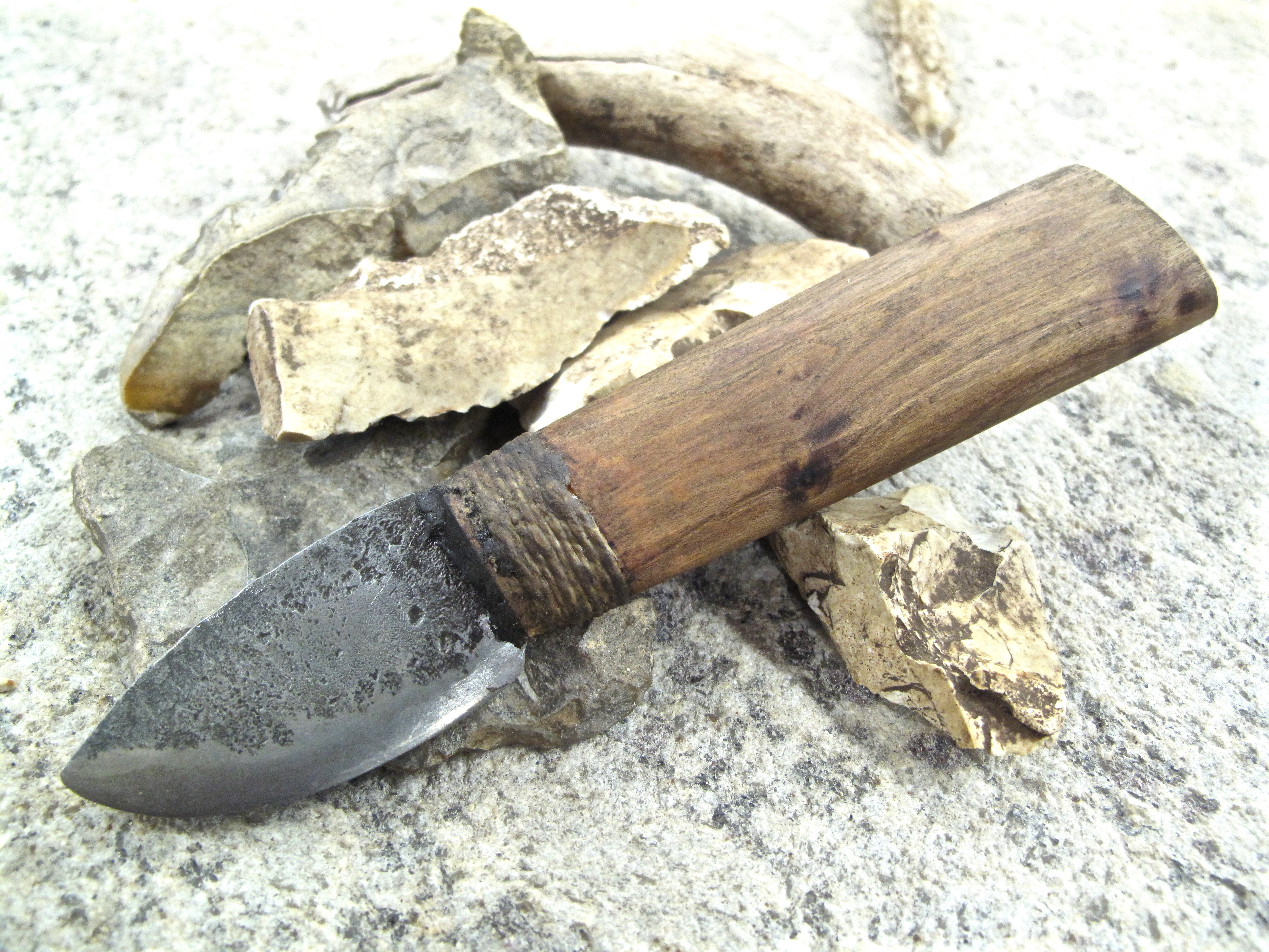
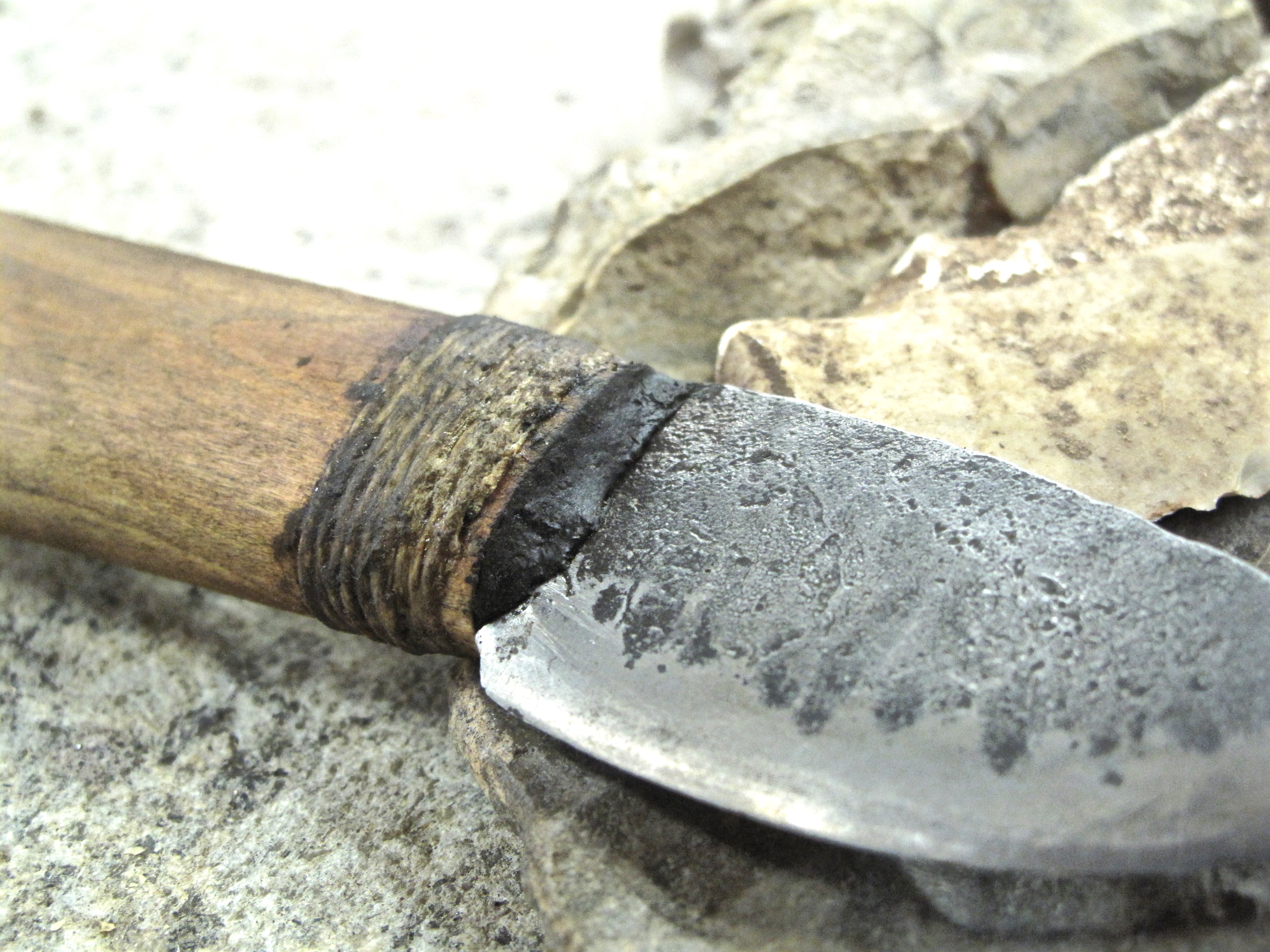
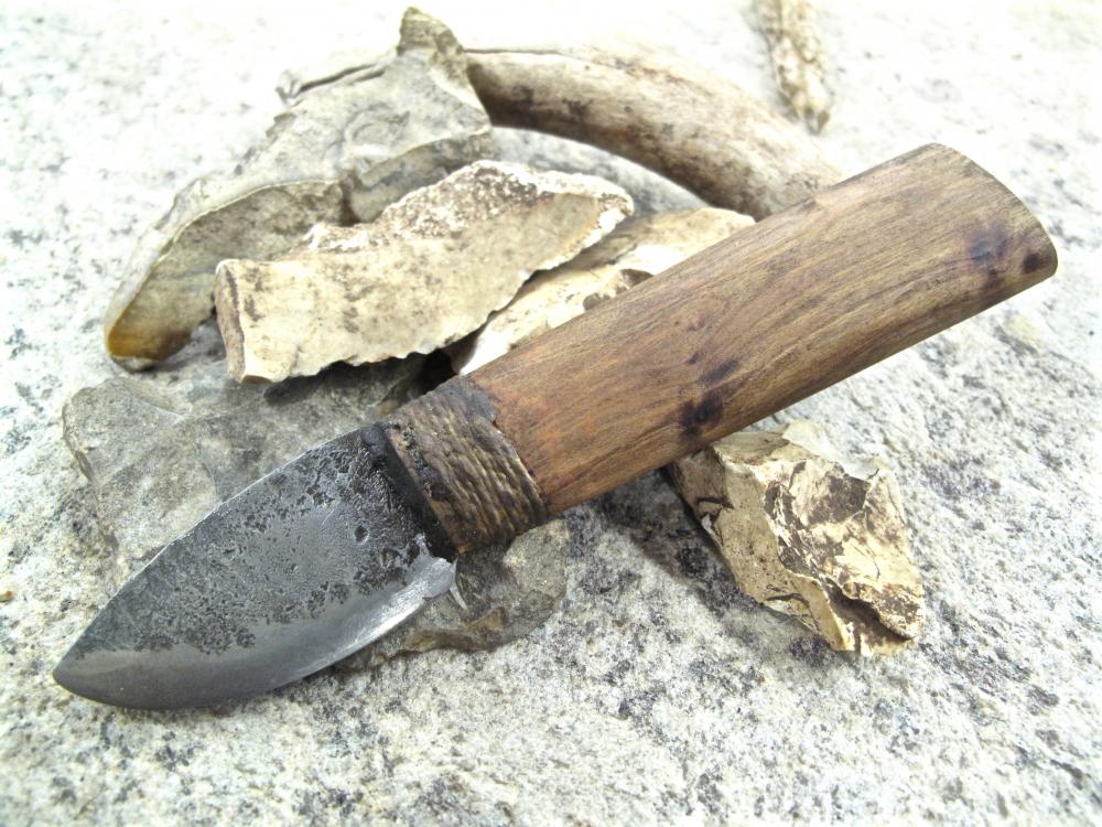
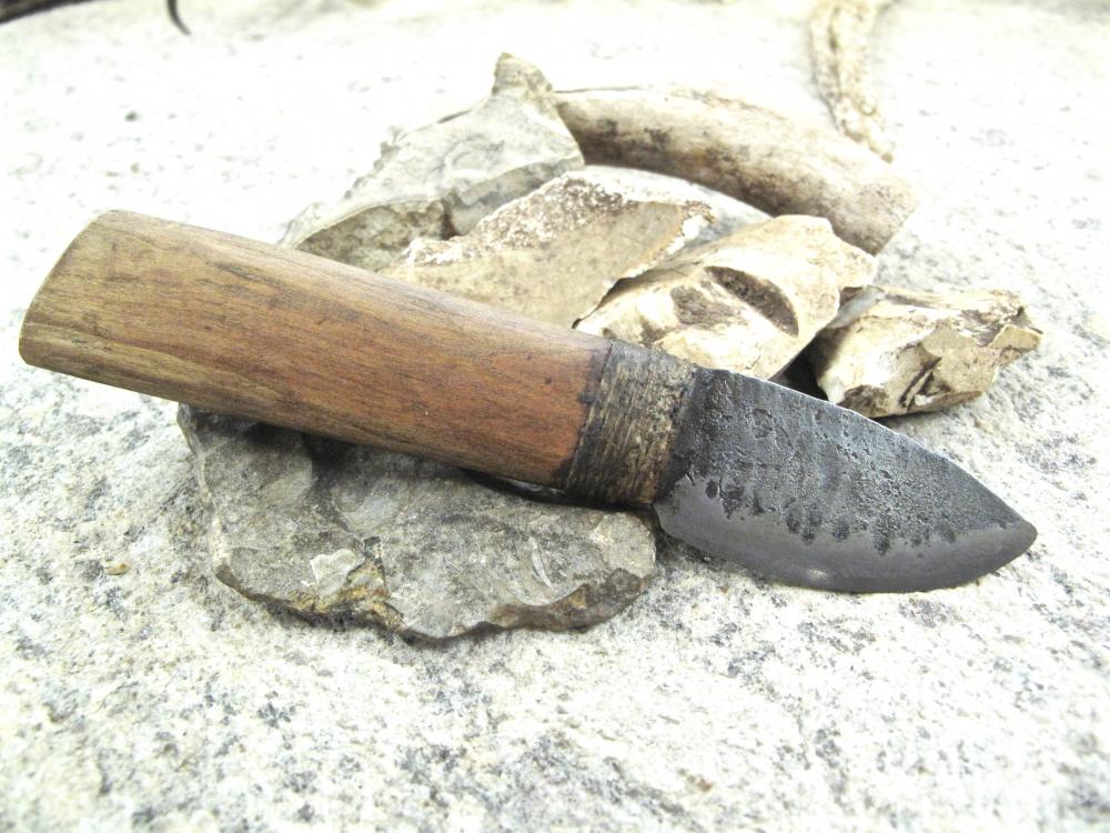
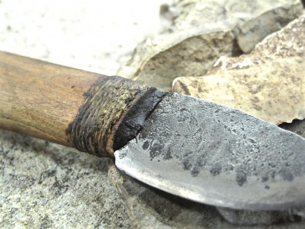
Thank you for the kind words, gentlemen. The hardest part about making this knife was keeping the primitive look . I see a lot of "primitive" blades that just look like they were made by intoxicated chimpanzees, and too much sanding and polishing on the handle would have clashed mightily with the rough steel. You can still feel some of the gouges left by the flint scraper that helped shape the handle, but they are very fine and don't stand out to the eye. I half expect the wood to check a little bit because it still had some moisture in it. Part of me wants a check or crack to help bring out the primitive feel a little more. I can always wrap the break with some rawhide to make it look like a field-expedient repair! As for the sheath... well, it just happens to be the right month to pull Poplar bark, so I might go that route. I've got a slew of home-made rawhide (calf and deer), so I could go with some of that over a leather core. Absolutely at a loss for the design of the sheath, so I'll most likely wait a while.
-
I've had this on the "to do" list for ages and finally got around to putting rubber to the road. The blade is 1080 from Admiral Steel, water quenched and tempered to a nice bronze (twice). The handle is a section of a limb off my plum tree that a freak ice storm brought down. I used hemp thread for the wrap instead of sinew, and coated it with hide glue to help weatherproof it a bit. The wrap is recessed into the wood so I don't have to worry about it going anywhere. For the blade, I was trying to go for something that resembled knapped stone or a leaf. I was hoping for the former, but would have been satisfied with the latter. I didn't quite get what I was going for, but I'll not kick her out of bed for eating crackers! The pitch glue is just to cover the end of the handle. I used Gorilla Glue to secure the blade in place, no pin, and will be curious to see how it stands the test of time. All and all, I think Otzi would like her. She's very comfortable in the hand, not too big or too small, and seems to be holding a decent edge. Now I need to work on a sheath!
-
Never thought to brush a handle to bring out the grain like that. Know what I'll be experimenting with next time I'm in the shop! Beautiful piece. From start to finish, top to bottom, excellent in design and execution.
-
Don't feel bad, M. Contrary to popular opinion, tongs aren't a beginner project. Good tongs (that fit the metal and are comfy in the hand) are as much a safety item in the shop as they are a tool. Bad tongs allow metal to slip, but they also fatigue the smith and can cause him to tire fast and make mistakes. Buying a set of quality tongs from a reputable maker will allow you to advance in the trade more than you might imagine. There's just nothing like a set of tongs that fit snugly and feel good in the hand. Step back and master those other projects. The skills you learn there will allow you to make good tongs in a little bit.
-
That first photo has me drooling. I have some weird fetish for old house jacks like that, and I have no idea why. I don't even own any - just like the idea of them and looking at pictures of them. I guess I should start hunting around the flea market for one or two just so I can say I own a few. The lever jacks in the second photo might be worth something if they go to a specific car. A lot of restorers are always looking for that last little detail to complete a rebuild.
-
M, before settling on a design, think about the story you want to tell. Creating a universe around your work is every bit as important the quality of your work, and it's the one place where most smiths fall short. Customers buy into the story every bit as much as they do the product. They want to be part of the experience. A good example of this would be the way Mad Dwarf Workshop took special pains to create an internet presence that revolved around the type of work they were doing, and the meaning they were trying to convey through their work. They explained their stuff and their thinking. Now, Cedarlore Forge does the same exact thing, making sure to keep the photographs, text and overall appearance of their website in synch with the product.
-
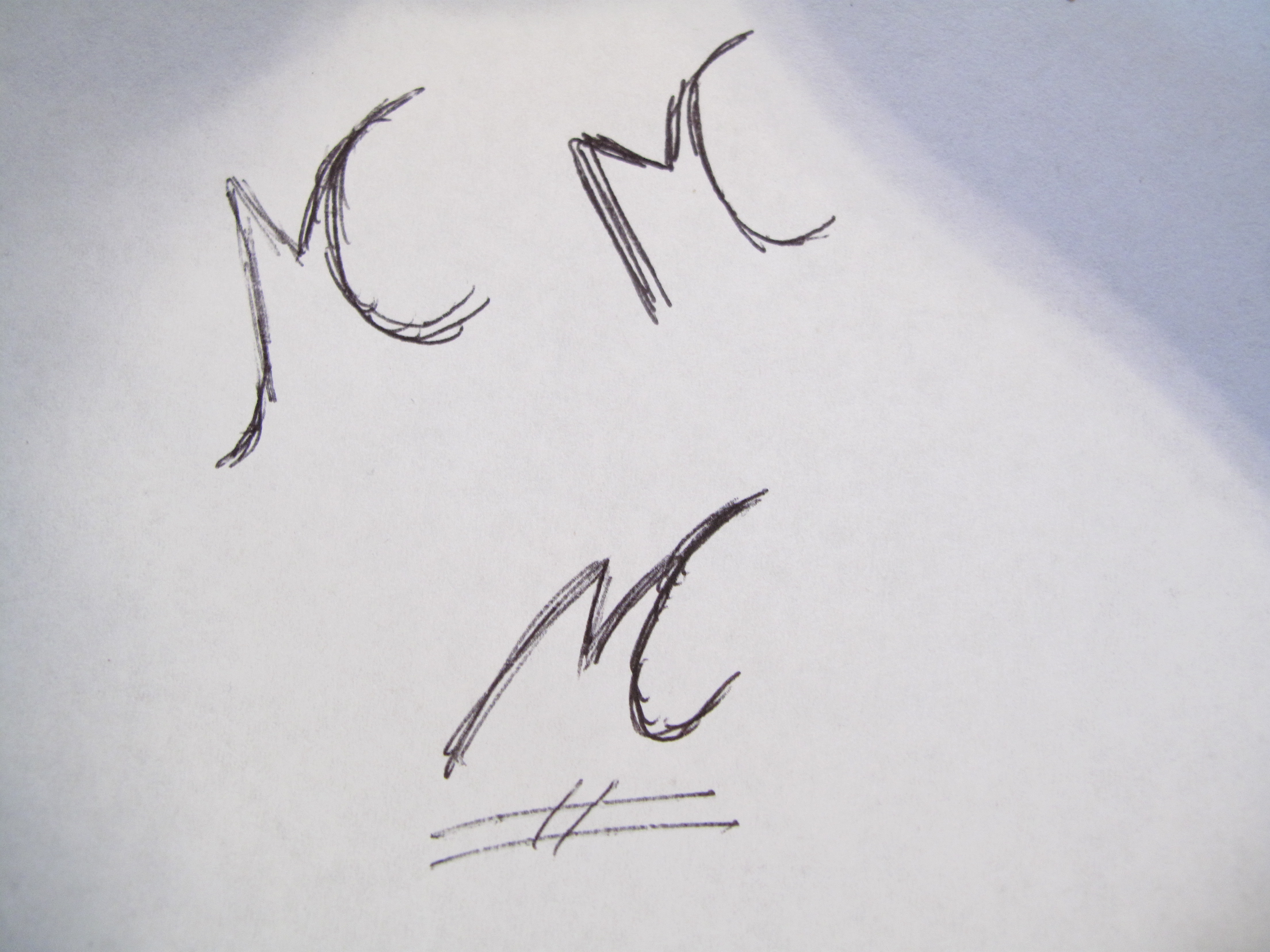
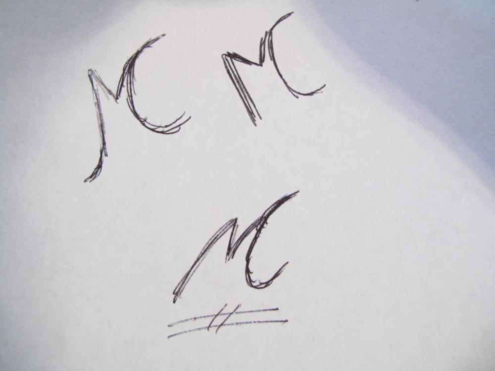
M, I was thinking something more along the lines of something like these..... Obviously, there is a lot of room for improvement in my oh-so-artistic renderings, but they kind of give you an idea. I like the one on the bottom the best. You'd be surprised how many fonts there are that actually look different from the norm, and in a good way. That's where I got the idea for combining the initials into one glyph.
-
Mountains over a lake? I can see that now that you mention it, but it certainly wasn't obvious. Whenever you consider a mark, try to think of it in terms of the overall impression of the universe you need to create around your products. If you tell the story of how you came up with the mark, mentioning that lakes and mountains are your favorite places and inspired the design, folks can see it. If you don't, folks see a sleeping C similar to what is used on ranch brands. Also, consider how the mark will look when stamped into crusty metal. What looks great with pen and paper looks absolutely wretched sometimes once stamped into anything other than highly polished steel. Similarly, a design that looks good gets ugly quick when scaled down to the size appropriate for a small knife. I highly recommend you peruse some of the free font generators on the internet and check out various combinations of the letters. Straight lines like you drew can be nice, but a bit of flair certainly can't hurt. I was really surprised at how many fonts are out there in the wide web of the internet. Some will work, some won't. But they all give you a tremendous variety to choose from. You can scale them up or down to see how they work. Move them around to see how nice they can look in various orientations. And when you hit on an idea, you can tell the maker that's it's XYZ font, something that they can easily look up and render into their computers. And don't fret. You're not the only one struggling with a design! I've been pondering the issue for well over a year and might just be suffering paralysis by analysis.
-
The only caveat I give folks when it comes to making their own touch mark..... Your mark is a sign that will last for a thousand years. Do you really want to fab something on your own knowing full well that you are very limited in skill, tools, experience, to make a sharp attractive design that will look good and reflect well on your shop? I've seen a lot of home-made marks, and they are almost always large, crude affairs that were clearly made by someone that didn't have the tools and skills to do the job. This isn't to say that there aren't great examples out there. Just consider for a minute the fact that professional companies don't hesitate to hire professional designers and professional engravers to make their marks. These are folks that have the tools and training to make you a mark that really shines. Most times, the professionals have ideas that you've never thought of because they've done this a thousand times before. They can give you guidance on size and style. They can use specialty steels that stand up to abuse, and give them the proper heat-treat. As for your specific design, go for it. I'd be more inclined to combine the C with the right leg of the M, making a smaller mark, but your design doesn't look bad. The "sleeping" C is different.
-
It won't work great for general smithing simply because of the lack of support. If you buried in a log all the way up to the horizontal part, it would work okay.... but that's a job of work. Much better to either save it for sheet metal work, or clean it up and sell it to someone so you can fund the purchase of a thick block of steel to use as an anvil.
-
The struck end of any tool needs to be dead soft. Mushrooming is a cost of doing business and far far cheaper than the medical bills resulting from catching a flying shard of steel as it takes off like a speeding bullet. Your 150# anvil can easily handle a 10# sledge, especially for one or two strikes needed to put a mark on something.
-
Never thought to make a handle like that. Consider the idea stolen! Excellent design and build, imo. Unique, different, unusual, unexpected.... I like it!
-
I couldn't imagine that. With such a weak tie-in with the main body, even wrought iron would deform if you did anything more than the lightest hammering. Something like a twisting fork would work in that little shelf, but anything that required serious hammering, like a bottom tool, would quickly ruin the little shelf. Definitely an unusual protuberance. Beautiful tooling, Basher. It's great to see the old girl back in action after all these years!
-
False, the smaller one you last showed, with the cartouche, will probably work. If that's the actual size, I think you're pushing the limits of what you can do with a hand-held punch and get consistent strikes. The larger one... way too much mass to move around. Those thick black likes and all the letters will require you to use a press of some kind, or a ten-pound sledge. I could be wrong, but I don't think you'd get a good impression even if the metal was good 'n hot. If the shop is already set to do the work, let them do their thing and consider it a learning experience. An 8" stamp might be good for you, and you can always cut it shorter if you feel the need. Personally, I generally mark metal while it's cold so I can get precise alignment without worrying about losing the heat or getting burned. If you find yourself doing a lot of hot stamping, that long shaft would be really nice to have!
-
It couldn't be a wax because it was far too runny. If the pot had been heated to make the wax liquid, there wouldn't be dried wax on the outside. The lack of flare up in the fire (which would happen rather instantly) would indicate to me that it's some type of clay-like material. It might have a small fraction of oil in it, something slight enough to burn off without a flare up. Interesting stuff. I was curious about all the pounding he did on the stump. All he seemed to be doing was hammering the blade into a curve, then reversing it. No idea what that was supposed to accomplish other than proving that the welds were solid.
-
Looks mighty fine, M. I just made one similar and bent it 90º so I could mount it on a wall. Lots of folks prefer that "primitive" look for their decor, and bending it to be a wall-mount piece kind of hides a lot of the little flaws that aggravate us as the makers.
-
I wouldn't use an 8" shaft on the touch mark. That's mighty long and most companies I've seen are only offering a 5" punch for hand-held use. Also, the more massive the punch, the more energy will be needed to break it loose. A body at rest tends to stay at rest, after all, and getting a pound of steel to move is far more difficult than getting a quarter-pound of steel to move. As for size of the actual mark, think about the types of things you do. While you want your mark to be visible, you don't want it to stand out like a squished bug. A small mark can be used on items big and small, but a big mark only looks good if the piece it's on is proportionate in size. Also, pay attention to line thickness and the open spaces between and inside the characters. If you're putting a mark on cruddy steel, covered in scale and hammer marks like so many customers prefer, you'll lose a lot of the detail in your mark. Heavy, thick lines, as has been mentioned, require a ton of force to sink into the metal. The more there are, the more force it takes. The cartouche surrounding your initials can afford to be thin because it's only there to draw the eye to the initials. If it's too thick, you're adding to the work needed to drive the stamp into the metal. Of course, a lot depends on how you plan on stamping the metal. A lot of pros recommend using a press whenever possible because it allows you to get precise placement and depth. If you go that route, you don't have to worry too much about the rest.
-
If you can get word from the folks that work on the machines, and can say that it is for sure h13 or the like, yea, I'd be open to a trade. Can't assume that everything is H13, though. Stainless steel comes in a lot of varieties. That piece on the far right has caught my eye and I'd be curious to know the dimensions. I could see it being a slitter chisel or drift if the size is right and it's H13 or similar.
-
How big does the head need to be? For a cooking grill, I'm thinking the noggin would be at least a foot long just to keep to scale, but.... I'd start with a wire frame made from cold-bent 1/4" round stock to get the shape set. Then fill it in with what you can. I make dragon fangs from bar stock that would work for a head that size....
-
One trick I've learned..... If you mark your work with a center punch, make the punch a 4-sided pyramid rather than a conical taper. The flat angles show up a lot easier on the glowing metal, though I can't explain the science of why.
-
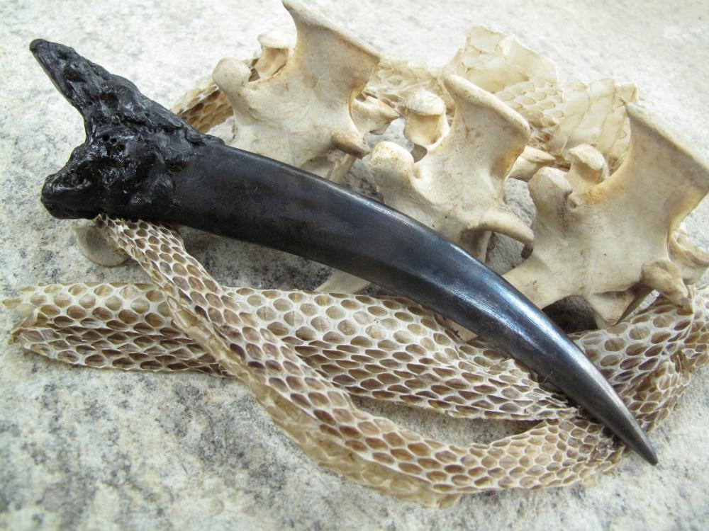
Jacques, that is absolutely fantastic! You can tell your dragon was just as bad as mine when it comes to dental hygiene! We had another dragon getting rather uppity and bothering the local cattle herds. So the guy that runs the spread called me up last week to give them a hand dispatching the critter.
-
Beautiful. I followed the build thread with interest and am glad to see that she's running perfectly. Another project for the list!
-
To give you an example of what you might run into with larger and more complicated designs, I just mailed out a small leaf-style blade to a fellow. The whole thing was only 1.25" wide, at best, and was covered with hammer texture to give it that primitive look. There was no place to put a large maker's mark and the uneven texture precluded using anything complicated or detailed. On a blade that's not very big, even if it's polished to a mirror shine, a large maker's mark really detracts from the look of the piece. I've seen folks that cover most of the cheek with their full name, the 'blade smith' title, and their city/state. The idea is that they want people to be able to find them and buy knives from them.... but they do it at the expense of the appearance of their work, and limit themselves to just blades that are highly finished and large enough to fit their billboard mark.
-
I'd go with out the helmet. Remember, what looks good as a sketch on paper can really get sucky fast when you scale it down to something appropriately sized for a maker's mark. Also, you have to take into account the type of surface the stamp will be going on. Nicely polished knife blades can show a lot of detail. Rougher finished like you see on a lot of forged work.... well, the detail is lost in all the muck and mire of the surface. The 2 F's are good. Play around with different fonts to see what looks good. Shrink the size down so you don't have something that would completely overwhelm a smaller piece. Keep it simple and clean instead of gimmicky. Professionalism is about the quality of the work and you don't want to get "typecast" as it were because people see your logo and think you're all about making armor and not candle stands or other household wares.