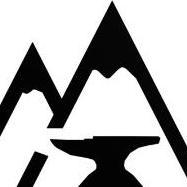
May 31, 20224 yr Author pulled a drawing of an public document in the program and walla thinking I might put a hammer beside or would that be to much?
May 31, 20224 yr I like it. Looks more like mountains. Now, see how it looks reduced down to the size you'd actually be using. I think you'll find that adding a hammer would make it harder to read.
May 31, 20224 yr Looks much better, MJ. I agree that a hammer would be too much. Now, you have to decide how you are going to strike it into your work. You could have one made commercially (about $US 100 IIRC the last time I checked, about 5-6 years ago). You can strike in the mountains with 4 chisel blows and have the anvil as a separate punch. IMO it would be pretty demanding to make your own punch with this design, not impossible but not easy. "By hammer and hand all arts do stand."
May 31, 20224 yr Author printed out at 1/2" with and without hammer you where right its almost to small then i decided to thicken the edges and enlarge the anvil a hair more so its bolder the only thing im unsure of is the space between the anvil horn and the mountain should i increase that?
June 1, 20224 yr On 5/31/2022 at 3:56 PM, M.J.Lampert said: im unsure of is the space between the anvil horn and the mountain should i increase that? I think so, and furthermore, you can angle the bottom of the space under the horn, like this: (Although that detail might not come through in the smaller size.)
June 1, 20224 yr Author that definitely improves the look now do I leave the anvil horn facing left or flip it to face right really I cant decide which looks better (I like them both) leave your opinions below thanks
June 1, 20224 yr Frankly, either is good. Pick whichever way matches how you have your anvil set up in your shop.
June 1, 20224 yr Horn to the left is (in my opinion) better as the eye starts at the point of the horn and then follows the anvil to the heel. It follows the way we (in the US) are taught to read, left to right.
June 2, 20224 yr MJ, are you left handed or right handed? Both work great! Pick what feels right to you. David
June 2, 20224 yr I don't know if anyone mentioned it, MJ, but nice avatar. Way better than that green M. Recognize that right off the bat. Nice logo. Wish I'd chimed in on the design, though if I had it might not look so nice...
June 2, 20224 yr 14 hours ago, Glenn said: It follows the way we (in the US) are taught to read, left to right. Unless we're being taught to read Hebrew, Arabic, Chinese, Japanese, Vietnamese, or Korean, of course. (Or Old Hungarian runes, boustrophedon Greek, or Egyptian hieroglyphs, the latter two of which are bidirectional.)
June 2, 20224 yr Author goods left but i needed to make sure it looked fine for the general population who are not perfect 1 hour ago, Nodebt said: Way better than that green M. Wish I'd chimed in on the design, though if I had it might not look so nice... ya the green M almost reminded me of a old hospital look but i didn't have something i liked for this site before other sites have nice little items but they didn't seem to cross over to here
June 2, 20224 yr As a final test, use the design to create a return address for an envelope, stationary, business cards, etc. You do not have to go to production, just test out the creation.
June 2, 20224 yr My great-great-grandfather had an engraved full-body portrait of his prizewinning Merino ram on all his stationery (he was one of the people who introduced the Merino sheep to Vermont in the 19th century). It would not have made a good touchmark.
June 2, 20224 yr Author 3 hours ago, Glenn said: return address for an envelope, stationary, business cards i believe this would look nice and the Wile E. Coyote automatically goes with an anvil maybe a line on the back saying smashing coyotes since 2022 or would animal rights get after me for that?
June 2, 20224 yr On the thumbnail on my laptop that piece under the horn almost looks like a teardrop.
June 2, 20224 yr Author 1 minute ago, ThomasPowers said: that piece under the horn ? the lower section of mountain after the cut out?
June 2, 20224 yr If I had to pick my least favorite thing it'd be the foot of the anvil. It should be solid, not standing on feet like that. That's just a matter of taste though, "To each his own said the old lady as she kissed the cow." To quote my Grandmother. It looks good, I like it. Frosty The Lucky.
June 2, 20224 yr Author 1 hour ago, Frosty said: If I had to pick my least favorite thing it'd be the foot of the anvil. It should be solid, not standing on feet like that. not sure how i missed that yes i agree that needs fixed
January 6, 20233 yr Author so i was looking at a map book near an area that I had been in and noticed this place thought it was an interesting place this got me thinking that perhaps my name choice of Two mountains Ironwork which was meant to be describing an imaginary point in my mind but i recently found that that is the translation of a town in Quebec (Deux-Montagnes) so I decided to think of a Place that holds more significance to me while still keeping the touchmark so my mind when to my grandparents ranch at the base of the Ilgachuz Range so I decided to have a look and the closest peak in that system is Tundra Mountain. now the reason I posted all this is I'm trying to decide between Ilgachuz Range Ironwork or Tundra Mountain Blacksmithing both which turn up nothing close in web searches tia M.J.Lampert ps. ilgachuz Edited January 6, 20233 yr by M.J.Lampert ps, b/c font shows l and I as same
Join the conversation
You can post now and register later. If you have an account, sign in now to post with your account.