M.J.Lampert Posted May 27, 2022 Share Posted May 27, 2022 so I've decide on a name for my smithy "Two Mountain Ironworks". Now i am trying to decide on my touchmark/logo i have narrowed it down to two options but cant get past these 2 choices. I am looking to get a 1/2" stamp from Columbia Marking tools with whatever my final decision is. if y'all wanna throw your word in that would be appreciated thanks M.J.Lampert Quote Link to comment Share on other sites More sharing options...
George N. M. Posted May 27, 2022 Share Posted May 27, 2022 MJ, I would go with the one with the single cross. I largely say that because I am of the opinion that faith and craft/business are separate parts of a person's life and should be kept separate, at least as they are presented to the outside world and other folk. An expression of faith or political belief can elicit both positive and negative reactions. A cross or an icthys or a political bumper sticker can turn people on or off and, IMO, it is better to avoid that particular can of worms. Even as a Christian I have always thought that a business listing or sign with a icthys was tacky because it seemed intended to attract customers because of their and the business owner's faith rather than business considerations. I've always thought that the name "Christ Centered Ironworks" is semi-inappropriate because of that and that it diminishes the faith by mixing it with worldly and mudane issues. I recognize that faith is very important to some people (me included) but I don't think wearing a symbol of your faith on your sleeve all the time is the way to go. IMO faith is demonstrated to the world by how you live your life and your actions rather than a label or sign. Just my 2 small currency units. "By hammer and hand all arts do stand." Quote Link to comment Share on other sites More sharing options...
M.J.Lampert Posted May 27, 2022 Author Share Posted May 27, 2022 ok George that makes sense and one could also loose some customers due to a show off faith as well here's the item edited to remove the crosses and tightened it up so it would be a little neater Quote Link to comment Share on other sites More sharing options...
Frosty Posted May 27, 2022 Share Posted May 27, 2022 One of the things my Father drummed into me growing up are the 3 things you NEVER discuss at work or groups except special select groups. The three poison topics are: "Religion, Politics and Money" in that order. You'll notice they're also forbidden topics on Iforge as well. They are just too emotionally charged for casual conversation in a public place. Most any public place, politics and money tend to cause trouble at church. I only know of a couple business with any religious symbols displayed and those quietly and never discussed. Making a religious symbol a touch mark that will be imprinted on products you want others to buy is frankly a bad move. How would YOU feel about buying a product with a Star of David or perhaps one of the many symbols of Islam? Frosty The Lucky. Quote Link to comment Share on other sites More sharing options...
ThomasPowers Posted May 27, 2022 Share Posted May 27, 2022 Ahhh TMI has an alternate meaning nowadays---Too Much Information; if someone tries to google your mark what sorts of things will bury your smithy? Quote Link to comment Share on other sites More sharing options...
George N. M. Posted May 27, 2022 Share Posted May 27, 2022 MJ, yes, I like that better and it avoids my concerns. The only other suggestion that I have is to be conisitent with serifs (the little "feet" on the tops and bottoms of letters). Your T and M are "san serif" (no feet) but your I does have serifs. I suggest consistency one way or another. Personally, I like serif fonts (the one we are using here is san serif) and studies have shown that people read a bit faster in a serif font. The serifs apparently "lead" the eye from one letter to another. Of course, that is of little concern with just 3 initials but I find it interesting. Whatever you find aesthetically pleasing to your eye. "By hammer and hand all arts do stand." Quote Link to comment Share on other sites More sharing options...
M.J.Lampert Posted May 27, 2022 Author Share Posted May 27, 2022 1 hour ago, George N. M. said: serif fonts messed around a little and i will agree that the serif fonts look much better though when the combined letters are centered the m is slightly out of line i tried all the fonts on the site (a meager 12) and couldn't get that quirk out still think it looks nice another idea that came to mind was to use just the letters but after thomas' comment i think that might be a bad choice Quote Link to comment Share on other sites More sharing options...
George N. M. Posted May 27, 2022 Share Posted May 27, 2022 The other question is whether you want to personalize it to yourself (MJL) or your business (TMI). If TMI has a negative connotation how about "Two Mountains Forge?" Or "Two Mountains Blacksmith?" Or, since you are in an officially bi-lingual country, "Forge des Deux Montangnes?" GNM Quote Link to comment Share on other sites More sharing options...
Irondragon Forge ClayWorks Posted May 27, 2022 Share Posted May 27, 2022 As a name for your forge Two Mountain Ironworks, I really like, however the touch-mark logo does not convey that to me. At first glance, I thought who is M with too much information. (as Thomas pointed out). Maybe if you could make the mountains look more like mountains it would work better. Also the letters TMF would not work after googling it. How about making the mountains look recognizable with Ironwork or just Iron below, or just an anvil shape. Quote Link to comment Share on other sites More sharing options...
M.J.Lampert Posted May 27, 2022 Author Share Posted May 27, 2022 27 minutes ago, George N. M. said: Or, since you are in an officially bi-lingual country, "Forge des Deux Montangnes?" GNM as my french extend to "French fries" and "French toast" i think that would be a bad idea as people may approach me expecting service in french 16 minutes ago, Irondragon ForgeClay Works said: Also the letters TMF would not work after googling it. why must slang ruin all the acronyms?? Quote Link to comment Share on other sites More sharing options...
Frosty Posted May 28, 2022 Share Posted May 28, 2022 If you widen the mountain bases the M should center for you, maybe drop one font point if it doesn't. How about "Twin Peaks Ironworks," the TV program is old and unpopular enough there probably aren't that many people that'll make a connection. Oh okay, "Two Peaks Ironworks," then. Peak carries good associations as in, "He's at his peak!" Peak Ironwork intimates your iron work is at the top. Hmmm? Frosty The Lucky. Quote Link to comment Share on other sites More sharing options...
ThomasPowers Posted May 28, 2022 Share Posted May 28, 2022 Make the M to be two mountain peaks? Quote Link to comment Share on other sites More sharing options...
Frosty Posted May 28, 2022 Share Posted May 28, 2022 Something like that, there's already a BIG M representing the two mountains. Then there's the M itself. I'm not sure how I'd work it if two is too many Ms. Frosty The Lucky. Quote Link to comment Share on other sites More sharing options...
ArmySoldier72 Posted May 28, 2022 Share Posted May 28, 2022 When ranchers are trying to come up with a brand it is similar to a touch mark, just a tad bit bigger. There is a little more room to make your brand visible. You can see some rough hand made ones out of rebar and the brand part is all connected. But I think the concept may be the same. Touch marks seem to have the capacity to have more detail. I am not good with MS Paint.... but what about something like this. Don't laugh to hard ARMY Quote Link to comment Share on other sites More sharing options...
George N. M. Posted May 28, 2022 Share Posted May 28, 2022 L like the mountains and anvil but what does the T represent? GNM Quote Link to comment Share on other sites More sharing options...
BillyBones Posted May 28, 2022 Share Posted May 28, 2022 Frosty, i loved that show. Dang, it dating myself again. A good rule of thumb that grandad taught me "Politics and religion do not belong in polite conversation." MJ, is there a significance for the 2 mountains? I mean like are they a prominent feature of the land scape for you or something? Also as far as centering goes when you give the maker your design tell them you want the "M" centered and when they do the layout they should be able to make the correction. Quote Link to comment Share on other sites More sharing options...
Frosty Posted May 28, 2022 Share Posted May 28, 2022 A brand IS a touch mark and I shudder when I think of people using rebar branding irons. An I makes some sense, there are already two mountains no need to add a T. I certainly wouldn't put it on top like that, the peaks are supposed to represent the pinnacles of the craft. It gets too busy with the anvil if there's anything else inside the peaks. Morning Billy, we're typing at the same time again. Believe it or not I just ran across a reference to "Twin Peaks" watching something totally unrelated. Funny world eh? Frosty The Lucky. Quote Link to comment Share on other sites More sharing options...
ThomasPowers Posted May 28, 2022 Share Posted May 28, 2022 Out here brands are important and there is quite a bit that goes into making a good one. Folks tend to cut off the leg of C channel to get steel with a taper to it. The thicker part to hold heat and the thinner part to make a clean "impression". You also need to make sure you don't have a continuous "circle" as the interior may rot with the circulation compromised. You also need to make sure that you are NOT trespassing on someone else's brand or one easily modified from another brand. Not too long ago; being caught with a running iron in your possession was a fatal mistake! Quote Link to comment Share on other sites More sharing options...
George N. M. Posted May 29, 2022 Share Posted May 29, 2022 Most western states have a state office of brand inspection which maintains books of registered brands. Brand Inspectors are sworn law enforcement officers (like game wardens) who have full arrest powers. Using someone else's brand or an unregistered brand is a criminal offense. Branding household items, yourself, your kids, etc. isn't a problem but if you use an improper brand on livestock things will get pretty old west real fast. And, yes, cattle rustling and horse stealing are still a serious criminal problem. Even buying livestock without the proper paperwork or brands is a criminal offense. Brand Inspectors do a lot of their work at livestock auctions. "By hammer and hand all arts do stand." Quote Link to comment Share on other sites More sharing options...
bluerooster Posted May 29, 2022 Share Posted May 29, 2022 My Grandpas brand was quite simple. His initials JM. But it's similar to but different than the king ranch. at first glance they could be confused. However, the registry notes the difference. Dad had his brand registered as PT,(Poco Tejas) but never used it. Quote Link to comment Share on other sites More sharing options...
ArmySoldier72 Posted May 29, 2022 Share Posted May 29, 2022 Yes brands are a big deal out here. Lots of paper work and a problem if you are crossing state lines without inspections. Unless you are a huge farmer or rancher with thousands of heads or acres, most small operations need other income to supplement the farm / ranch income. My step son was working towards becoming a brand inspector. They go through the same training program as police. Below is his brand BAR T Cattle, he came up with the name before what the brand would be. I found this interesting when doing some research, BAR would actually be more like a DASH, but that was taken already. And there is a brand symbol for rocking, leaning, lazy, etc Google Cattle Brand Symbols, there are some REALLY cool looking ones. Back to the topic though, in my picture above I put the T because MJ was going for TMI or TMF BUT I fully agree the T could be omitted and the M could be drawn out to look more like two mountains. It was just a thought. ARMY Quote Link to comment Share on other sites More sharing options...
ThomasPowers Posted May 29, 2022 Share Posted May 29, 2022 I have a friend who is a rancher out here. He told me that some years he makes more money running elk hunts on the ranch than from the cattle. Of course out here "carrying capacity" is 1 to 1.5 sq miles per head! Most ranches have a fairly small amount of "deeded" land and a whole lot of leased grazing rights land. We're still a "Fenced Out" county. You have to fence your land to keep cattle out----The interstate is fenced off with cattle guards at all the exits too. Quote Link to comment Share on other sites More sharing options...
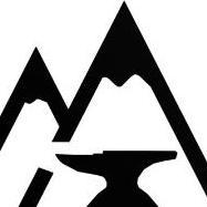
M.J.Lampert Posted May 30, 2022 Author Share Posted May 30, 2022 (edited) sorry i rarely go on during the weekend funny i had been thinking a similar idea i took a little liberty with army soldiers idea and made it more of a mountain there is no significance of the mountains other than i enjoy the outdoors and have a draw to the hills Edited May 30, 2022 by M.J.Lampert Quote Link to comment Share on other sites More sharing options...
George N. M. Posted May 30, 2022 Share Posted May 30, 2022 MJ, I suggest making one peak a little lower than the other. That way there is less confusion with the letter M. Also, if you can make the outline of the mountain a bit irregular they will look more mountainous. Right now, the straight lines make it look like a combination of the letters M and Y. "By hammer and hand all arts do stand." Quote Link to comment Share on other sites More sharing options...
M.J.Lampert Posted May 31, 2022 Author Share Posted May 31, 2022 22 hours ago, George N. M. said: I suggest making one peak a little lower than the other there think i need to smooth the anvil though Quote Link to comment Share on other sites More sharing options...
Recommended Posts
Join the conversation
You can post now and register later. If you have an account, sign in now to post with your account.